scroll to see more
30 years of glad mornings
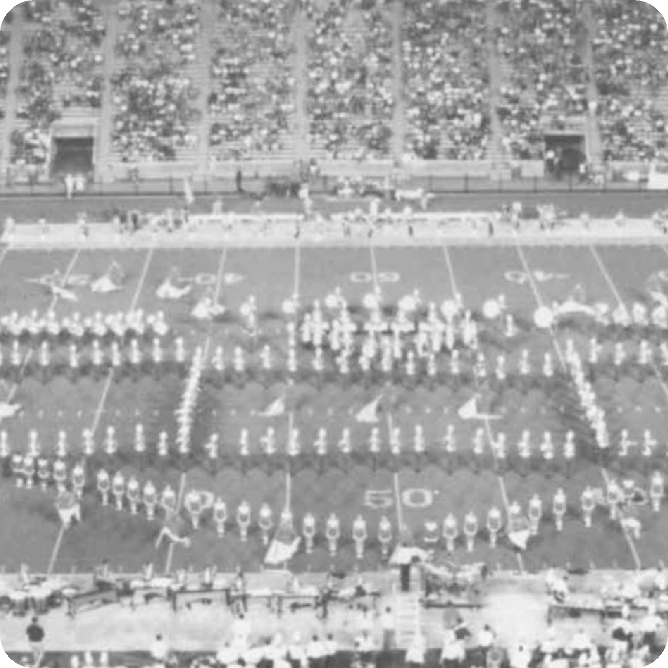
Inspired by the 30 years of Dr. Kenneth Bodiford’s direction over the Marching Southerners, the show, titled “Reflection” ,seeks to showcase the favorite moments from Dr. Bodiford’s career with the Southerners. The designs created for this show were carefully created to reflect the origins of Dr. B’s start with the Southerners. With inspiration from the 90s, halftone texture, black and white film, and the merging of contemporary motion graphics, this show design has become one of my favorite projects to date.
halftone texture
high contrast
showcase the past
stay consistent
break the rules
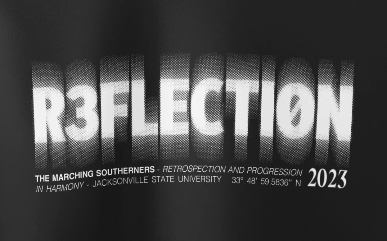
When creating the Wordmark / Title Design, I took in account the five elements above. As multi layered concept, the Wordmark uses each element to create a cohesive mark. These elements are not bound to only the Wordmark. These five elements should be used throughout all marketing media used to showcase the 2023 production “REFLECTION”.
application & use
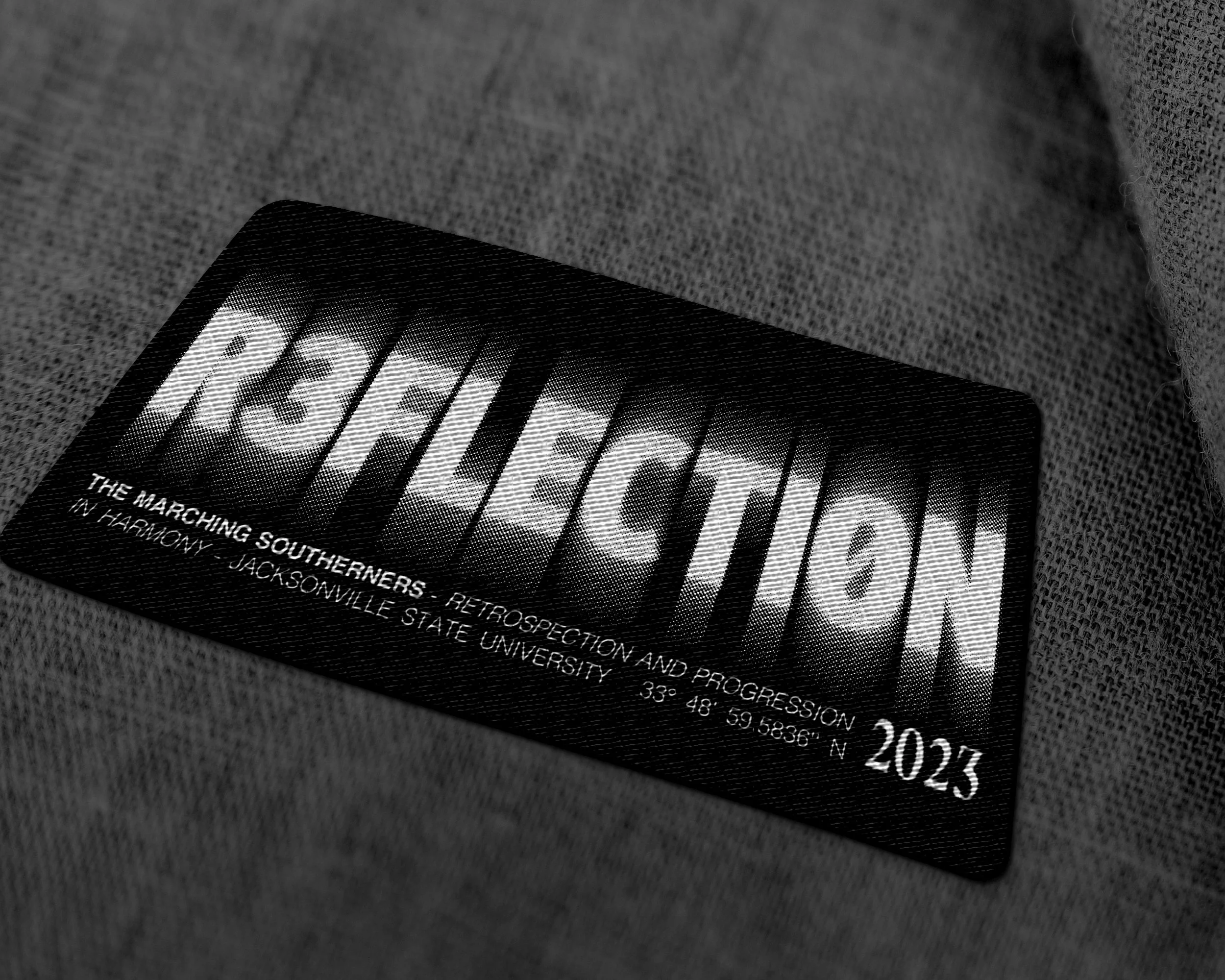
The designs that follow this section of our guide are purely there to help the viewer understand the sometimes complex and complicated application of design elements, marks, and concepts. These mock-ups allow us to view how the system we’ve created is applied to multiple different mediums and can better assist those who don’t have a background in graphic design or art create pieces that will reflect the foundation of design elements and style we have created to help keep all marketing material consistent and professional.
LIGHTS. CAMERA. ACTION!
Each year I’ve had the amazing opportunity to create a release video for the upcoming season for the Southerners. This year was by-far the best turn-out for the early release party, where we showcase the video to members, filling the entire performance center! The following video is a shorter version below but if you would like to watch the full version you can watch it here.


